Reading changes in the specialist knowledge people value
“What kind of work would you like to do? What should you study to prepare for it?” These questions offer one starting point for thinking about education and careers. For someone who has a particular job in mind and can see what they need to learn, such advice can be encouraging.
But does it capture the whole relationship between learning and work? We may quietly assume that what someone studies at school determines the knowledge central to their later work—or that the two ought to match.
Rokugeisha’s Data Instrument, “Where does your field of study fit into your work?”, offers a way to examine that relationship through specialist knowledge. What did people study, and which fields do they associate with their current work? We place those pairings on a single plane and let readers explore them by location, age and the set of work responses included.
The “changes” discussed here are not a continuous record of any individual’s career. They are differences between the field a person reports studying and the field they report in relation to current work, as well as differences between the distributions of groups selected by different filters. We use these differences to consider how widely learning and work can connect.
Looking at work through knowledge alongside industry and occupation
One way to understand work is to look at the industry someone works in and their occupation. The survey asks about these separately, so those responses can be combined with other information in an analysis.
This chart focuses on responses about specialist fields. People with the same occupational title may associate their work with different knowledge. Conversely, people in different industries or occupations may name the same field. We want to explore relationships that job titles alone may not reveal, through the fields respondents themselves select.
We use the 2025 human resources survey data published through e-CSTI by the Cabinet Office of Japan. The survey asks about four relationships with specialist fields. The table summarizes the questions.
| Perspective | What the question asks | Number of choices |
|---|---|---|
| Educational background | The field mainly studied in the laboratory or seminar for the respondent’s highest education level, or the field they devoted the most effort to if they did not belong to one | One |
| Current work | Specialist fields closely related to the work they currently perform | Up to three |
| Business development | Fields they believe will become important for new developments or growth in the business they are involved in | Up to three |
| Interest in learning | Fields they would like to study if given an opportunity to learn now | Up to two |
We begin with the one field studied and the single field recorded as the first choice among those selected for current work. Each person contributes one pairing. Later in the article, we use the same tool to expand the response set to include up to three fields at work.
The title uses the word “value,” but the work question asks about how closely a field relates to the respondent’s work. It does not measure how much knowledge they possess, their proficiency, or an importance score. Below, we call the single selected field the “first-ranked field at work.”
The field studied is not simply a department or degree title, either. It is the field the respondent selects to characterize their educational background. Connecting the two responses gives us a glimpse of how they describe their learning and their current work.
Organizing field labels into four colors
The published field master for 2025 contains 300 response categories. Of these, 298 name specific fields; the remaining two are “Other” and “None.” The available categories differ by question, however. The current-work question does not offer “None”: respondents choose from 299 options, including “Other.”
The list spans fields such as Japanese literature, accounting and bookkeeping, and infectious diseases. Some labels cover several areas, so these are not disciplines divided at a uniform level of detail. The Japanese–English field reference provides the original labels. It also includes categories from earlier surveys, but this distribution layout uses the 298 specific fields from 2025.
To make this range easier to explore, Rokugeisha organizes the fields into four groups.
| Letter and color | Group | Number of fields |
|---|---|---|
| A, blue | Language, culture and society | 57 |
| B, pink | Mathematics and information | 38 |
| C, yellow | Nature, materials and technology | 110 |
| D, purple | Life, health and everyday living | 93 |
We began with subjects and courses taught in Japanese high schools. Alongside general subjects such as Japanese language, mathematics and science, we considered areas taught in specialized programs, including technology, commerce, agriculture, nursing and welfare. For example, Japanese language offers a starting point for Japanese literature, commerce for accounting and bookkeeping, and mathematics for statistics and data science.
These connections do not mean that a specialist field can be fully learned in high school. They help readers approach specialist knowledge through learning they may already recognize. Where a field did not fit readily into school subjects, we used other starting points: mathematics and computation as methods, people and society as objects of inquiry, or life and medicine as areas of concern.
Moving from these starting points to four groups was not a mechanical assignment based on school subject names. Biology, for example, goes toward life, while agricultural economics goes toward economy and society. For fields spanning several areas, we made individual judgments about which aspect to use as the main guide.
The details are available in our organization through high school subjects and courses, organization through objects and methods of knowledge, and field assignments and their rationale. The reference table gives the group and placement rationale for each of the fields numbered 1–298 used here.
The four colors are neither an official classification by the survey authority nor clusters automatically detected from the responses. They are guides that Rokugeisha has placed in the chart to help readers navigate it. We do not change assignments between filter settings to fit the counts or a result we hope to see.
What a position and the diagonal represent
Start by selecting “Top view.” The horizontal X axis lists fields studied, and the vertical Y axis lists first-ranked fields at work. Both axes contain the same 298 fields in the same order: A, B, C and D, with fields arranged by their original codes within each group.
Each person’s response corresponds to the intersection of their field studied and first-ranked field at work. People reporting the same pairing share that position. In an oblique view, a thin stem represents their number through its height. A dot on the base marks a pairing reported by at least one person.
With this arrangement, people whose two fields match lie on the diagonal running from the lower left to the upper right of the square. Those outside the diagonal chose different labels for education and work. Two different labels within A, for example, still place someone off the diagonal. An entire square block such as AA or CC is not the region of matching responses.
Nor does being farther from the diagonal mean a greater change of specialty. Coordinate distance here does not measure differences in knowledge or the difficulty of moving between fields.
Return to “Oblique overview” to see the numbers rise above the plane. Rotating the view changes what appears on the left or right of the screen, but X remains the field studied, Y the field at work, and Z the number of people. By default, height is logarithmic in “count + 1.” This compresses the tallest stems so pairings involving fewer people remain visible; twice the height does not necessarily mean twice as many people. Select a stem or dot to see the actual count, or switch to a linear scale.
With all locations and no age limit selected, the chart displays 51,205 of the 64,544 respondents whose field studied can be paired with their first-ranked field at work. Both fields must be specific named fields to appear. The other 13,339 respondents, whose pairings include “Other” or “None,” are outside the chart. Its 14,272 distinct pairings bring together the responses of more than fifty thousand people.
No chart contains the whole of any person’s life. Even so, it is striking to have the relationships between so many people’s learning and present work within a single field of view. That is part of what makes this visualization interesting to us.
Reading the peaks and the spread together
Color represents the group on the education side. Selecting A lets you follow where people who studied language, culture and society are distributed on the work side. You can switch to B, C or D in the same way.
There are 24,309 respondents from A in the chart, the largest of the four groups. Many also select A on the work side, but they are distributed across B, C and D as well. Knowing that someone studied language, culture or society does not by itself determine the range of knowledge involved in their work.
There are 3,840 respondents from B, which may make this group appear small in the full chart. Yet it, too, connects to fields outside B. A smaller visual presence should not be mistaken for less need for that knowledge or less value in it.
Of the 15,407 respondents from C, 11,494 also select a field within C for their work. But only 3,333 select the same individual field label for both. The dense CC block contains many responses connecting different fields.
Among the 7,649 respondents from D, approximately 39.4% select the same field, the highest matching proportion among the four groups. Still, they also connect to different fields within D and to A, B and C. D includes a wide range of fields concerning life, health and everyday living, not only medicine; its peaks cannot simply be read as counts of medical doctors.
Across the whole chart, 12,940 people lie on the diagonal and 38,265 outside it. Approximately 74.7% of those displayed chose different fields for education and work. The diagonal is just one line within the plane, but its geometric thinness does not determine how many people occupy it. Counting the responses establishes how many people are outside it.
Look beyond the high peaks to the thin stems between and around them. We think of these many small pairings, spread across a broad plane, as a “Milky Way of people’s learning and work.”
Comparing places of education, work and residence
The location filter has two conditions. One is which kind of place to use when selecting respondents. The other is the prefecture in which that place is located.
| Location type | Place used to select respondents |
|---|---|
| Residence | Where they currently live |
| Workplace | Where they currently work |
| University / final institution | The location of the institution for their highest education level in the survey |
| High school | The location of their high school |
We compare these as places of education, work and residence. High school and the final educational institution concern educational history; workplace and residence concern present activity and living. For a postgraduate respondent, the university / final institution location does not refer to their undergraduate institution. Selecting this condition does not restrict the population to university or postgraduate graduates.
For example, switching from residence to workplace within the same prefecture compares people who live there with people who work there. Selecting high school lets you explore the relationship with current work among people who attended high school in that prefecture.
These switches select different populations. The chart is not following the same people, step by step, from high school to university, work and residence. Pairings involving few people are also less likely to be observed in prefectures with fewer respondents. Read a sparse plane alongside its respondent count; it does not directly establish that opportunities are absent in that area.
Field positions and the height scale stay fixed across locations. “All locations” includes response categories such as Overseas.
Why we raise the age limit
The other filter is age. You can switch between under 25, under 30, under 40, under 50, under 60, and no upper limit. Age is measured at the time of the 2025 survey. “Under” excludes the boundary age itself.
These are not mutually exclusive age bands. Under 30 includes those under 25, and under 40 includes those under 30. The conditions are cumulative: younger respondents stay in the group as older respondents are added.
We introduced this filter to explore whether the distribution of knowledge associated with work might broaden as people gain experience after leaving education. We chose 25 and 30 as the first cutoffs to look more closely at younger respondents. Being under 25, however, does not by itself identify someone as a recent graduate or a person in their first job.
Putting the present circumstances of people of different ages alongside one another can offer clues about how relationships with knowledge might broaden from education into work and later experience. In that sense, our intention is to explore something of the course of a life.
This is not a panel survey that repeatedly follows the same individuals. A 45-year-old respondent describes their current work at 45. Their answers at 25 or 30 have not been preserved in this dataset. Nor does the cumulative aggregation recreate one population growing older.
Reading different age groups as stages along a life course requires the assumption that conditions across generations are comparable. If one generation faced a markedly different labor market when entering work, for example, that experience may still affect its current distribution. Having many respondents does not automatically remove such cohort differences. This chart does not separately estimate the effects of aging and experience and those of generational differences in education and labor-market conditions.
Checking the spread with four diversity measures
Before implementing the age filter, we examined the spread numerically. Here we restrict the population to people whose field studied differs from their first-ranked field at work, and calculate the diversity of the fields they select on the work side.
The proportion of people off the diagonal and the diversity of their fields at work are different quantities. Many people may be off the diagonal while their work-side responses are concentrated in a few fields. Conversely, a small off-diagonal proportion may be distributed across a broad range of fields.
Counting the number of distinct fields alone does not fully capture diversity. Ten fields with equal numbers of people describe a different distribution from one in which most people concentrate in a single field and only a few appear in each of the other nine.
We therefore calculate an “effective number of fields” from the proportions of people in each field. This expresses the distribution’s diversity as an equivalent number of equally represented fields. It is distinct from the actual number of fields observed in the responses.
We use q = 1, 2, 3 and 4 within a common framework known as Hill numbers. The parameter q is an order controlling how strongly fields with more respondents influence the measure; it is not an age or a number of years.
| Order | How to read the calculation |
|---|---|
| q = 1 | Shannon’s effective number of fields. Reflects the spread across the full composition, including fields with few respondents |
| q = 2 | The inverse Simpson index. Square each field’s proportion, sum those squares, and take the reciprocal |
| q = 3 | Gives more weight than q = 2 to concentration in fields with many respondents |
| q = 4 | Gives still more weight to concentration in fields with many respondents |
For q = 3 and 4, we do not simply take the reciprocal of the sum of cubed or fourth-power proportions. We raise those sums to the powers −1/2 and −1/3 respectively, so all four measures can be read as effective numbers of fields. For any q, a uniform distribution across ten fields has an effective number of ten.
Our question is how widely paths toward knowledge different from one’s educational field may be open. What these measures directly describe, however, is the diversity of work-related fields appearing in the responses. They do not measure the number of jobs each individual could actually have chosen or their freedom of career choice.
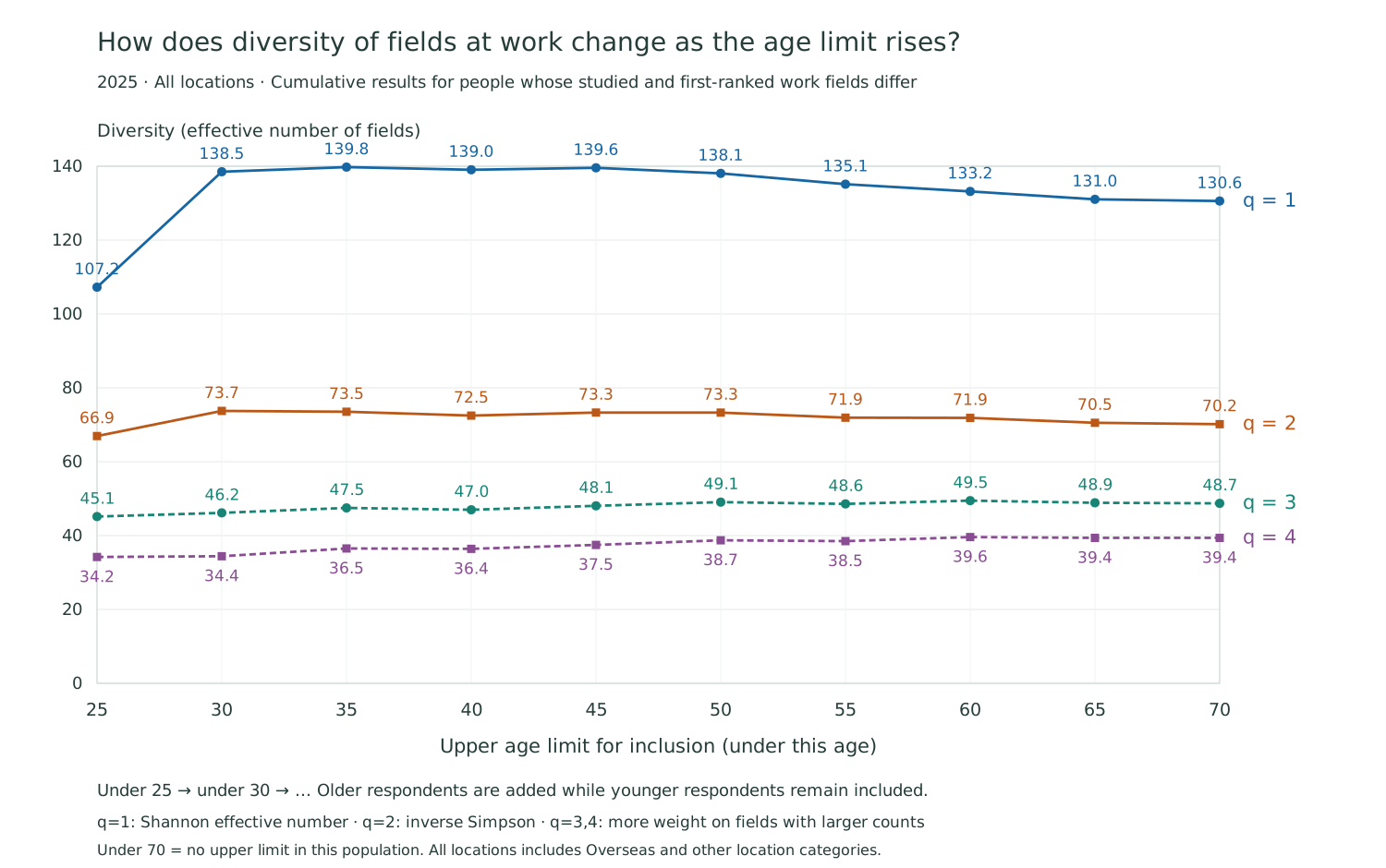
Figure: 2025, all locations. Calculated for respondents whose field studied differs from their first-ranked field at work. The horizontal axis is the upper age limit for inclusion, not an individual’s age. In this population, under 70 gives the same result as no upper limit. The preliminary calculations used five-year steps; the visualization’s filter offers a subset of those cutoffs.
Extending the population from under 25 to under 30 raises the q = 1 effective number of fields from approximately 107.2 to 138.5. The q = 2 value also rises, from approximately 66.9 to 73.7. The changes are smaller for q = 3, from approximately 45.1 to 46.2, and q = 4, from approximately 34.2 to 34.4.
This suggests that the spread increases when we give more consideration to fields with fewer respondents, while the change is relatively small when fields with many respondents exert a stronger influence. The four measures do not all show a jump of the same size.
Raising the limit beyond under 30 does not produce a uniform, continuing increase in diversity. The q = 1 curve is high around the under-35 cutoff and then declines gradually. The q = 2 curve remains around 70, while q = 3 and 4 rise gradually with small fluctuations. Rather than continuing to change dramatically, the distribution remains within a relatively stable range, with differences between the measures.
The sample sizes also differ. The chart contains 709 people under 25 and 3,081 under 30. Of these, the off-diagonal populations used for the diversity calculation are 575 and 2,327 respectively. Because the measures use proportions, increasing the number of people while holding every proportion constant would leave the values unchanged. But adding respondents in practice can make fields with small counts more likely to be observed, and it changes characteristics such as the mix of educational fields. We have not adjusted for these effects here.
Making learning after graduation the next question
One question this result invites concerns learning and experience after formal education. Might encountering new tasks at work and acquiring knowledge from other fields broaden the range of fields people associate with their work? The differences among the younger populations make this worth investigating.
The present results do not establish that learning becomes more active between ages 25 and 30. This aggregation does not show when, where or how new knowledge was acquired. Changes associated with learning would need to be distinguished from differences in tasks and employers, cohort effects, and changes in sample size and composition.
A difference between the field studied and the field at work does not necessarily mean that the knowledge was first acquired after graduation, either. Someone may have studied several things at school, with a field they did not select to represent their educational background now closely connected to their work. A single label does not describe everything they learned.
What the chart does show is that one field of educational background cannot fully describe the relationship with current work. We want to think about people’s capabilities in a way that starts with their education and also considers their later relationships with knowledge. This visualization can provide a starting point for further research and discussion.
From the first-ranked field to other fields related to work
So far, we have looked at the single field ranked first for current work. But the survey allows respondents to select up to three closely related fields. These responses can reveal connections that the first-ranked field alone does not show.
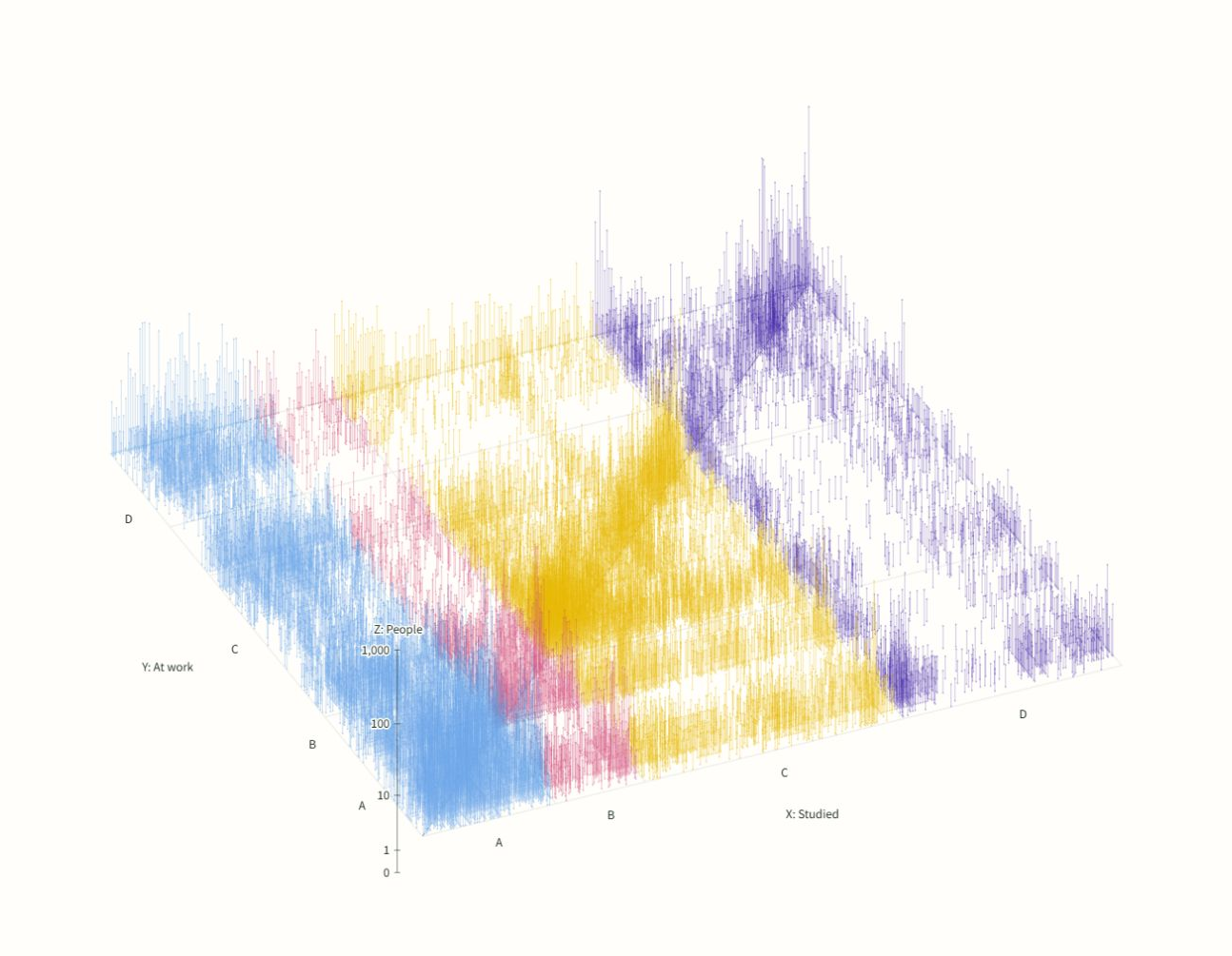
View the enlarged figure | Explore the interactive tool
Upper figure: the single first-ranked field
51,205 people shown, including 12,940 whose field at work matches their field studied.
Lower figure: all fields selected, up to three
51,293 people shown, contributing 98,165 selections. For 17,292 people, a selected field matches their field studied. Including fields other than the first-ranked choice lets one person appear at several positions, making the chart’s colors look denser overall.
Both figures show 2025 responses, all locations, no age limit and all fields studied. They use the same viewpoint and logarithmic height scale.
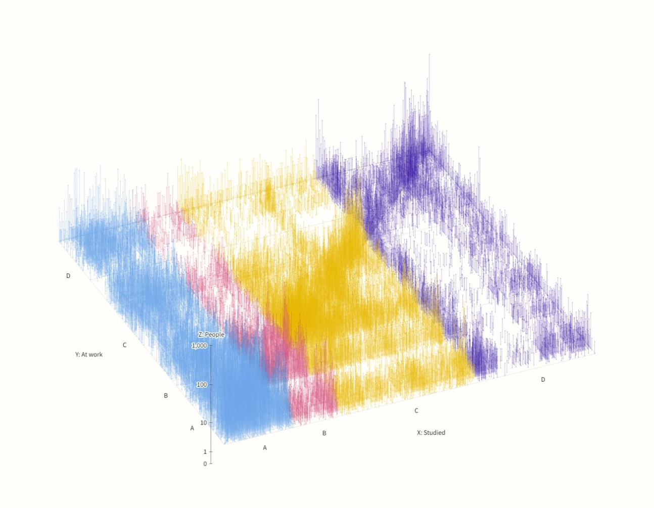
View the enlarged figure | Explore the interactive tool
The tool lets you switch between the first-ranked field, all selected fields up to three, and the other selected fields. With all locations and no age limit, the number of people with a matching field rises from 12,940 for the first-ranked choice alone to 17,292 when all selected fields are included. Some people still name their field studied as closely related to their current work, even when they do not rank it first.
Meanwhile, most of the additional responses lie outside the diagonal. Allowing multiple fields naturally produces more or taller stems across the chart. What we want to examine is where those responses accumulate. Connections to the same field studied increase, while many additional connections to other fields also appear.
When up to three fields are included, the same person can appear both on and off the diagonal. What someone studied can be related to their work while that work also draws on knowledge from other fields. Rather than treating learning and work as a simple match or mismatch, we want to consider these overlapping connections.
The data do not distinguish second and third place among the fields selected other than the first-ranked choice.
Thinking about educational choices through people beyond the diagonal
Return to the first-ranked field alone, and you see both people whose fields studied and at work match and people whose fields differ. Even among those under 25, 575 of the 709 people displayed—approximately 81.1%—are outside the diagonal. This does not identify their situation in their first job, but it does show that young respondents do not all name their educational field as their first-ranked field at work.
The connections along the diagonal have an easily understood story: someone studies a field and goes on to work in relation to it. Yet many responses lie outside the diagonal, with a wide range of fields on the work side. Is the same-field path alone an adequate standard picture for discussing people’s education and work?
“Choose what to study with your future work in mind” offers one route. If it becomes the only desirable route, we may overlook people who have not yet decided what work they want to do, who broaden their interests while studying, or who encounter new knowledge through work.
Selecting a field different from one’s educational background as the first-ranked field at work does not mean that the earlier learning is unused. Ways of thinking developed through philosophy or mathematics, for example, might support work on problems in another field. This survey does not measure that effect, but a mismatch between the first-choice labels does not justify concluding that the earlier learning has lost its value.
We do not want to call the diagonal the “correct career path.” Matching and differing responses both describe people’s present circumstances. When discussing the supply of people to a field, too, we want to look at connections from other educational backgrounds before equating the number of people who studied that field with the number supporting work in it.
Whether something leads directly to a future job need not be the sole basis for deciding the value of what you want to learn now. This is not a guarantee that any course of study will lead to the job you want. It is the position we want to share with young people after looking at the varied relationships between educational backgrounds and work.
Rotate the chart, change the age or location, and look at both the dense peaks and the thin stems spreading beyond them. They bring into view people who would be easy to overlook if we looked only at the diagonal.
Data and references
Source: Cabinet Office e-CSTI human resources analysis and open data (Japanese). Rokugeisha organized and aggregated the 2025 open data, p4ds2025 v1.0. Counts are actual survey responses; we have not extrapolated to Japan’s entire working population or adjusted for respondent composition.
For the field options and four questions, see Understanding learning and work through the survey’s fields of study. For how people may think about knowledge when answering, see What comes to mind when we are asked about our field.